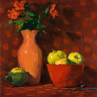
 I make my living as an illustrator and, like many commercial artists, the paintings I create are intended to solve a problem, express or clarify an idea, or render a product. However, I’m not interested in precise renderings of specific objects. I want my paintings to be as loose and spontaneous as possible–just tight enough so that the viewer can tell what they’re supposed to be.
My favorite subjects are still lifes that include lace, fruit, flowers, and people, and I often surround these with my own unusual fabrics and antique ceramics and objects. I try to create a mood and a sense of light in my paintings. When I’m painting a still life or figure, the picture should look a bit romantic without losing its feel of reality.
I try to create a look that makes even the most commonplace objects special. This desire affects all aspects of the composition. Because I want the painting to be unified, I work hard to integrate the background with the foreground; I don’t want the objects to look flat, or as if they have been pasted on the paper. Most photographers find shadows difficult to work with because they have no color, but as a watercolor painter I love them. In shadow areas, I can use color freely but still maintain a feeling of reality in the painting. One thing I have in common with photographers is the importance I place on proper lighting. I have a lot of photographic equipment, including a camera, tripod, lenses, and photographic floodlights, which I use to illuminate every setup.
My favorite surface is Arches rough 300-pound paper, which I staple to a hollow-core board. I use Winsor & Newton brushes in a variety of large sizes. I feel that the brushes have a great deal to do with the look of a painting: The pictures appear detailed but really are, as I’ve mentioned, quite loose. A lot of people use small brushes when working with watercolor, whereas I tend to use bigger brushes in such a forceful way that they lose their points quickly. I usually torture my surface, so I like heavyweight paper. The combination of the Arches paper’s roughness and the way I work chews up brushes, and I always seem to be buying new ones.
Most of my paints are made by Schmincke, Holbein, and Winsor & Newton. Typically, my palette includes aureolin, Opera, indigo, cerulean blue, magenta, purple-violet, brown madder, Winsor red, peacock blue, alizarin crimson, yellow ochre, viridian, ultramarine blue, and burnt sienna, and I often don’t use all the colors I set out. I never use black or white.
Once I’ve determined the direction of the painting, my approach is the same whether I’m doing a commissioned portrait, an illustration, or a completely personal picture. In the past, my style was more realistic. It was rather opaque and tight, and not very wet or watery; I mixed the color on my palette and then added water and color to the paper. However, during the past five years I’ve consciously loosened up my style a great deal–in terms of both process and color. In the past, if I wanted to paint an object red, I would mix reds on my palette; now, I might try the modern synthetic colors, usually using many reds and allowing them to mix themselves on the paper to achieve the intense color I want. I feel as if I’m enjoying the painting process more since my style has become freer, and I continue to look for ways to experiment. This shift in style has really changed my illustration career. I feel that the way I work now is unique and commercially more desirable.
I welcome opportunities for improvisation, and I’ve found that my loose style allows me to take advantage of accidents rather than be discouraged by them. Although I value spontaneity and looseness, my preliminary drawings are very tight. Every highlight, every shadow, and every detail must be in place before I start washing in the color. That way, when I’m in the painting stage, I can ignore details if I wish.
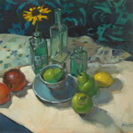
My process, then, usually begins with a very detailed graphite drawing. Usually, making the drawing takes just a few hours, although for Hydrangeas, the paper was so large that I spent an day or two on the drawing. On the average, my paintings take anywhere from one day to one week to complete.
When I start to paint, I rarely begin with the background first. Many watercolorists paint light to dark, but I start with the dark shadow areas and fade out to the lighter ones, putting in more color as the paper dries. I never use glazing techniques. The most important and unique part of my painting process is that I paint with water first and then place the color right on the paper, allowing the color to mix freely. I create a wet area by painting with a brush loaded with water, not by wetting the entire paper. By doing this, I can create soft edges and manipulate the paint.
I naturally seem to leave a lot of clean white paper for the highlights during the painting process. Also, once the painting is basically completed, I often wash out some of the color with a variety of stiff brushes and scrape out additional highlights with a razor blade. As I’ve said, I like accidents, and I think the spontaneous way I work encourages them. However, I keep white paint in a drawer to correct dark areas when necessary. When I find myself reaching for the white paint too often, I know it’s time for me to start over.
When I get an illustration assignment, I usually have a designated space to fill. The art director presents me with an idea to convey in the painting and often gives me the specific proportions to work with. With those guidelines in mind, I’m free to design the work–which entails not only painting, but getting or making any necessary props. I often spend a good deal of time shopping for objects I can use to decorate the setup and create the desired ambiance.
As a result, I’m very involved in all aspects of the picture-making process, and I’m also very familiar with every object that will appear in the painting. I do all my own food styling–if I need to paint a particular dish, I simply cook it and style its appearance. This can lead to disaster, though, as it did once when I had to paint a portrait of a woman decorating a wedding cake. Although I knew I could purchase the cake, I wanted to save money and do it myself. I finally managed to carve a tiered cake out of styrofoam and frost it, and then I attempted to make the flower decorations out of frosting. After spending six terrible hours trying to make flowers, I had only been able to come up with four awful, awkward shapes that resembled belly buttons! Finally, I gave up and bought silk flowers, which I then dipped into frosting and sugar. It looked elegant, but it cost more than a real wedding cake would have.
Being an illustrator isn’t easy. I work at least eight hours a day, every day, and often I’ll go for weeks painting seven days a week from about six o’clock in the morning until eleven o’clock at night. I’m not an artist who paints just because it feels good–I’m in this to make a living.
STEP 1. My process usually begins with a very detailed graphite drawing. In this piece, the paper was so large that I spent more than one day on the drawing. Usually, the drawing takes only a few hours. Every highlight, every shadow, and every detail must be in place before I start washing in the color.
STEP 2. I rarely start with the background, and this picture is no exception. When I begin, I paint with water first and then add the watercolors to the paper, allowing the color to mix itself. This allows me to create clean color and soft edges. Here, you can also see the photographs that I used for reference.
STEP 3. I wet the area on which I had drawn the vase and then went in with the color. A lot of watercolorists paint from light to dark, but I start with the dark shadow areas and fade out to the lighter ones.
STEP 4. In this detail, you can see how precise yet how loose the painting is. Some people use small brushes, whereas I tend to use bigger ones and in such a forceful way that they lose their points quickly. On the average, my pictures take anywhere from one day to one week to complete. Since it was so large, this piece took about one and a half weeks to finish.









Connect yourself with Chill Out Point to get daily updates!
SUBSCRIBE to Chill Out Point's News Feed to receive our fun articles as soon as we publish them. Don't forget to join our online communities on FACEBOOK and TWITTER.Newest fun stories available on Chill Out Point's news feed !